If a pink bell makes you think it’s time to live más, or the color orange makes you want a Dunkalatte, then you’re no stranger to the power of restaurant branding.
But what happens when restaurant branding goes wrong?
In this blog, we’ll look at the good, bad, and ugly of restaurant branding, from Cracker Barrel’s recent fiasco to why McDonald’s arches have stayed recognizable since the ‘40s.
(And, if you want a deeper dive on why restaurant branding even matters in the first place, check out this blog!)
Let’s get started!
Restaurant branding fail: Cracker Barrel
What happened with Cracker Barrel’s restaurant branding
On August 19, 2025, Cracker Barrel launched their “All the More” campaign.
Designed to celebrate everything that guests know and love about Cracker Barrel, the campaign included new and returning menu items, restaurant remodels, limited-time deals, a collaboration with country music artist Jordan Davis…
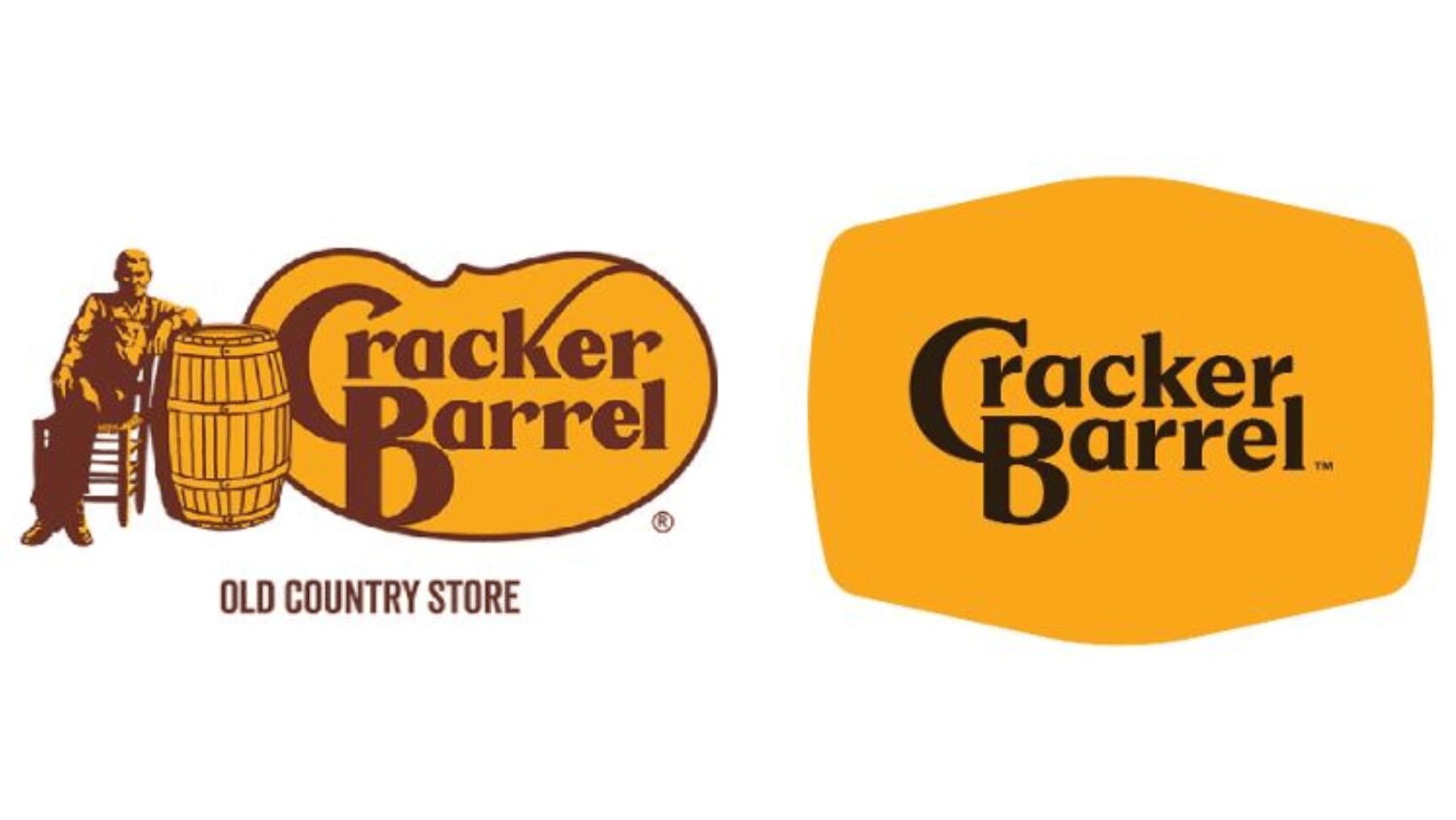
And “an enhanced brand look and feel” that included a shiny new logo.
While the new logo maintained Cracker Barrel’s iconic mustard-yellow branding, the similarities stopped there. The new logo ditched the rest of Cracker Barrel’s instantly recognizable restaurant branding, including Uncle Herschel and his chair, the “Old Country Store” wording, the secondary, brown brand color, and the barrel.
Part of the Cracker Barrel’s “enhanced” brand look also included remodeling their restaurants. About 20 locations got a makeover under this new direction, creating spaces with brighter walls, with fewer antiques, a more open floor plan, and, of course, the brand-new logo.
How did the public respond to Cracker Barrel’s new restaurant branding?
To put it simply:
Really, really poorly.
People were instantly furious that the “Old Timer” look and feel was changed, taking to social media to share their not-so-positive thoughts.
Some users were upset about how boring the new logo design is, calling it “minimalism done wrong” and claiming it looks too “corporate.”
Others said the new restaurant branding strayed from Cracker Barrel’s traditional feel, because “people go to Cracker Barrel so they can be taken OUT of the 21st century, not through it.”
The negative impact of the new logo didn’t stop at social media, either. In the week following the logo release, Cracker Barrel’s market value dropped by ~$100M, with shares dropping by 7.2% in just a few days.
Luckily, Cracker Barrel’s team was paying attention to the public’s response — and they actually listened.
How did Cracker Barrel respond to the public’s concerns?
Just one week after the initial rebranding announcement, Cracker Barrel shared a statement addressing all the new restaurant branding issues.
“You’ve shared your voices in recent weeks not just on our logo, but also on our restaurants. We’re continuing to listen,” the statement read. “Today, we’re suspending our remodels. If your restaurant hasn’t been remodeled, you don’t need to worry, it won’t be.”
The statement also specifically calls out the logo feedback:
“We thank our guests for sharing your voices and love for Cracker Barrel. We said we would listen, and we have. Our new logo is going away and our “Old Timer” will remain.”
Throughout Q4, the Cracker Barrel team has continued doing damage control.
At the beginning of October, the brand announced they’d cut ties with Prophet, the consultancy that “advised [them on] previous brand refresh initiatives, including the logo.” They also worked to rebuild hype by bringing back some holiday favorites (and introducing some new menu items) just in time for Thanksgiving.
Now, all we can do is wait and see what happens with Cracker Barrel over the next few months.
Only time will tell if Cracker Barrel’s restaurant branding rollback was enough to keep people coming back — or if it drove the wedge even further.
Where Cracker Barrel’s restaurant branding went wrong
At this point, it’s very clear that Cracker Barrel’s restaurant branding endeavours were not successful… but where exactly did they go wrong?
The way we see it, there were three big issues with their restaurant branding efforts.
1. It was too much, too fast
Even one change to a beloved restaurant’s branding would have been a lot for customers to accept, but completely changing the logo, the interior design, and the menu all at once? It was simply too much, too fast — and Cracker Barrel paid the price.
“Cracker Barrel could be modernized without completely changing everything about what the company is. Especially as a southern staple. Their changes should have been more [low-key] and smaller in the beginning.” — Reddit user Substantial-Fan3885
2. It strayed too far from tradition
What Cracker Barrel’s new restaurant branding tried to replace is actually what people loved most about the brand: its quirky, kitschy, country-store aesthetic. Customers couldn’t (or wouldn’t) reconcile the new branding with the traditional Cracker Barrel they know and love.
“[Part] of what makes [Cracker Barrel] fun is all the old-timey decorations and whatnot. [Without all that] stuff it would lose a ton of appeal to me.” — Reddit user Affectionate-Day2743
3. It came across as inauthentic
With a tagline like “Rooted in Hospitality Since 1969,” Cracker Barrel has become almost synonymous with old-timey country kitchen. So, when their restaurant branding turned totally modern and minimalistic, it felt inauthentic and gimmicky, because it didn’t match their values.
“This screams “we just want to cheapen the food and become like every other corporate restaurant.”” — Reddit user boneappleteeth1234
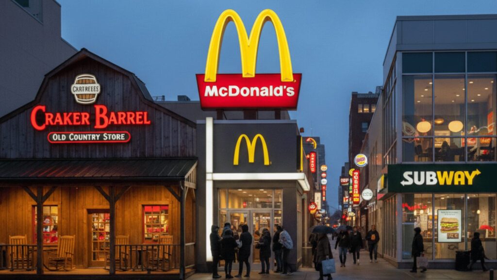
Restaurant branding success stories
It’s safe to say that Cracker Barrel didn’t have the most positive restaurant branding experience… but lots of other industry moguls have! Here are three examples of restaurant branding (and rebranding) done right.
1. McDonald’s
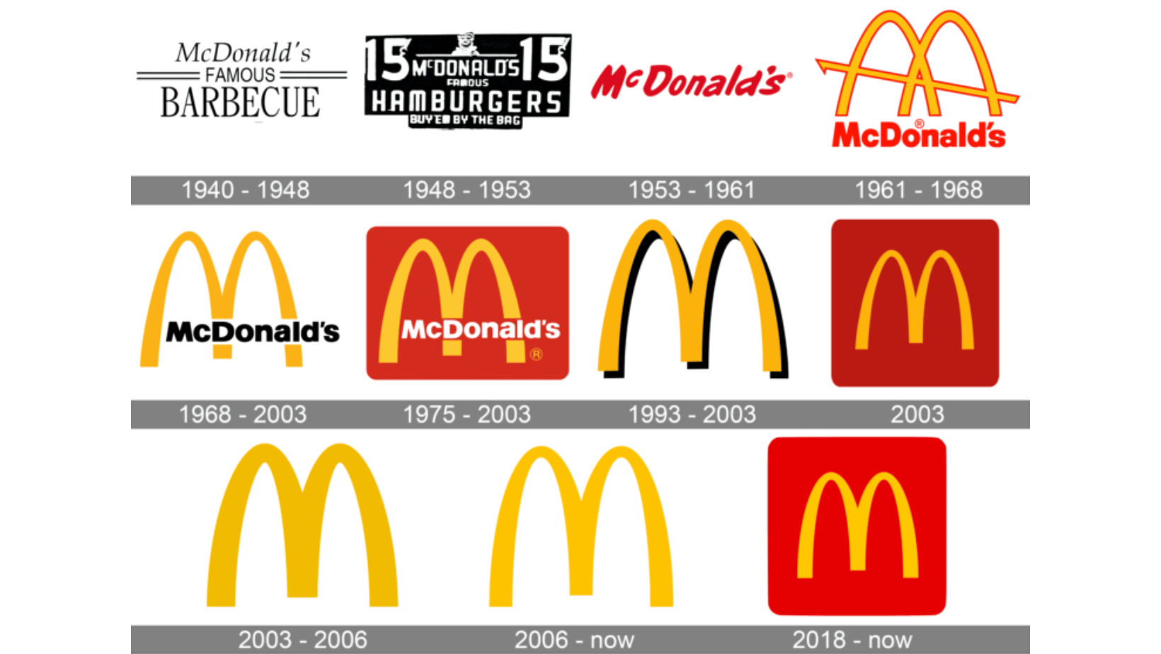
McDonald’s is an expert in the restaurant branding game. They’ve been subtly (and not-so-subtly) redesigning their logo pretty consistently since the 1940s, making changes to the logo as recently as 2018.
One of the reasons McDonald’s restaurant branding efforts have been so successful is because they never stray too far from their roots. They’ve always maintained the golden arches, the red accent colors, and the slogan, keeping their well-loved brand instantly recognizable (and in the good books of their customers).
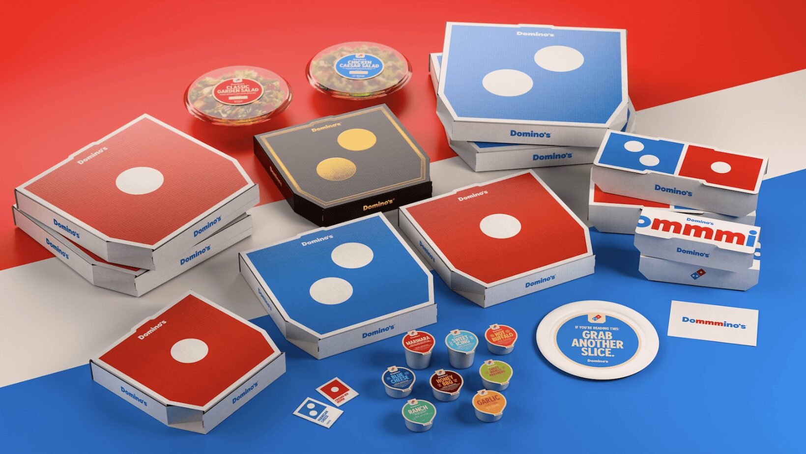
2. Domino’s
Another brand that’s done well with restaurant branding is Domino’s.
In October 2025, the well-known pizza brand revealed a “craveable brand refresh.” Their new look features brighter, “hotter” versions of their signature white/blue/red branding, a new gold-and-black design for premium offers, a brand-new font called “Domino’s Sans,” and a fresh jingle sung by the popular artist Shaboozey.
The best thing about Domino’s new restaurant branding is that it doesn’t reinvent the wheel — it just elevates what customers already know and love.
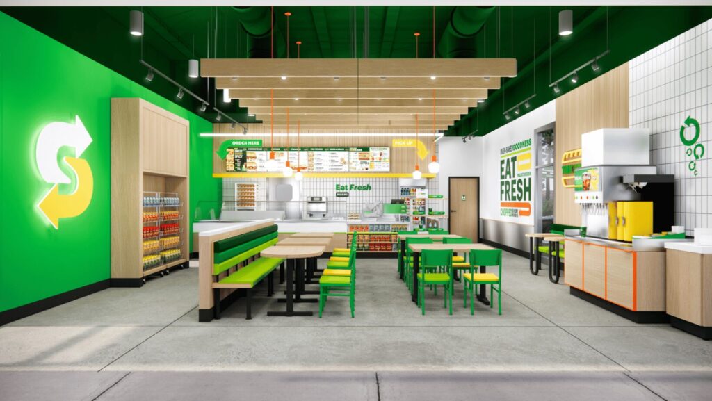
3. Subway
Our third (and final) example of good restaurant branding is Subway.
In November 2024, Subway announced a new image initiative called “Fresh Forward 2.0.” Alongside customer experience improvements (like touch-screen kiosks), the new strategy includes updated restaurant branding, including more vibrant decor, “elevated lighting, and warmer wood tones.”
Much like McDonald’s and Domino’s, the new Subway restaurant branding works because it doesn’t come out of left field. It sticks to its roots, offering small (but impactful) changes that don’t hurt brand recognition or tradition.
Restaurant branding tips for independent restaurant owners
- Test before rollout — Don’t just assume what kind of restaurant branding your customers will love. Ask them! Test out different elements of your new branding with your most loyal customers like ones on your mobile loyalty program to get feedback, opinions, and gauge first impressions.
- Keep signature elements — If there’s a specific element in your restaurant branding that customers really love, keep it in the new logo or brand identity. Having a signature element or logo is a good thing because it keeps you top of mind.
- Communicate the “why” — Whether you realize it or not, customers can get very invested and attached to your restaurant branding. So, if you want to update things, tell your customers what you’re changing and why. They deserve an explanation!
- Listen, respond, adjust — The only people more invested in your restaurant than you? Your customers. If (and when) your customers have thoughts about your new restaurant branding, make sure to listen, respond quickly, and actually consider their feedback.
- Start small — Even if your goal is to redo your restaurant branding completely, don’t try to change everything at once. Take things one step at a time and roll out your rebrand gradually. We’ve all seen what can happen when too much changes at once!